In any form of business and operations, the only stable and consistent means of drawing our attention for yourself is through professional emails or newsletters. They certify that your audience and customer base are updated about your line of business and also ensure a minimum level of engagement with the lot of them. Circulating professional emails and newsletters not only helps you in creating a better relationship with your customer base but has also been discovered to engage and increase your sales overall.
Email marketing is one of the full-proof ways to increase interest in you among your customer base and draw out a profit from the same. However, to bag those bills and profits, you may need to change your design to attract the eye of a regular audience enough to browse through your catalogue and products, in such a manner. Designing techniques and attractive email templates go a long way in ensuring your engagement among the audience and convert them into customers.
Page Contents
So what are email designing and templates?
Source: emailonacid.com
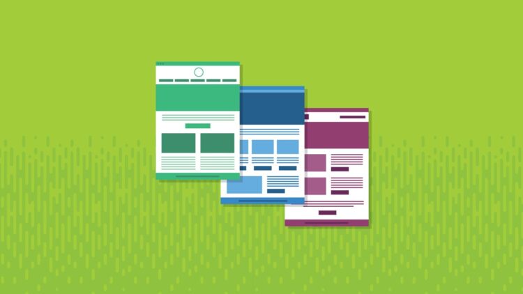
In the corporate world, when one receives hundreds of emails in a week, it can be naturally hard to keep track of those who are not from your boss or colleagues. As a consequence of these, the majority of your audience that may receive your email or a newsletter, a business operator, are quick to abandon them as promotional and not pay much attention. However, to counter this, all you need to is inculcate email designing into your templates. This will help you in capturing the organic attention of the potential customers and provide a far greater reach in the engagement process.
Your email designing must be the right amount of attention-seeking so as to please the audience and encourage them to know more about the products and services you may offer. If in case it becomes too catchy, the outcome might not be as expected. Hence, the following are some of the tips for the same.
Grab attention through the subject line
Whenever sending a catchy email, and between the recipients opening it, the best chance that you have of engaging their attention is through the subject line. The first thing any recipient may notice while checking any email in the subject line. In order to capture their interest, you should wish to frame your subject line in such a manner that it drives the recipient to open it and keep reading along. It must be a brief statement pertaining to the services you provide; however, attempt to arrange it in such a manner that it seems more like a conversational tone than a professional one.
Pre-headers are essential and engaging
Source: myemma.com
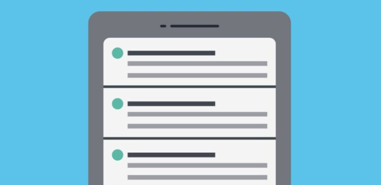
Moving on, if you manage to gain the attention of the customer through your subject line, it is essential to keep up the drift and engage them further with your pre-headers. Pre- header is the summary text that follows the subject line of the email. Both subject line and preheader can actually be viewed without opening the email.
Pre-headers can be used to provide a summary of the content followed in the email, so as to tempt the recipient to open and follow through. However, it is crucial to keep your pre-header short, simple, and crisp. You may even go ahead and keep them in a casual and conversational tone.
Be concise and straight
While drafting the content you wish to put in your email, it is extremely critical to keep it straightforward, short, and crisp. You do not want o to add any extra information which may make the content too off-putting, heavy, and drive away from the customer’s interest. You should only provide the information that is required to boost engagement and retain their interest.
This will ensure the impression on the recipient that their time is extremely valuable to you and thus, help in improving the overall retainment of the subscribers and engagement.
Keep your email on-brand
Source: webhostingsrbija.rs
Often, it happens that a recipient may open an email, read through half the content, and leave it because they did not see any sign of a brand or business operations. To avoid this, it is suggested that you should add a lot of email branding techniques to ensure the audience does not lose their interest in such a manner. When they open our email, they should know it is from your company.
You can use the following means to add branding-
- Use a tone in your content that is similar to the one used in engaging customers on your website and ads.
- Utilize a similar design and colour palette that you have used in your other marketing techniques.
- Provide information to your audience using your logo and social media accounts.
Enhance the experience through layout
Receiving an email that is extremely unorganized and cluttered makes the audience feel overwhelmed, and thus discontinues their interest in reading the rest of the information provided. In order to avoid that, you can opt to neatly organize your email and the information you provide in it.
Place your content in such a manner that it attracts maximum attention without overburdening the visuals in the design. Leave white spaces, and provide adequate spacing before beginning with more content in the email. Make sure your information is easy to grasp and navigate through. It also helps if you restrict yourself to a certain word limit to avoid giving too much information at once.
Attempt to personalize
Source: siliconangle.com
It is not uncommon to receive emails that are filled with informative content about the company and the business they provide with. These types of emails are, however, sent to a collective number of recipients with a professional touch to the content. In these cases, it may seem unappealing towards an individual recipient, and they could end up ignoring it.
However, to oppose this from happening, you can choose to add a personal touch when you customize emails and draft them accordingly for a target audience. This can make the email feel more personal, and actually end up establishing a rather engaging relation between you and the recipient. Moreover, the customer may feel more welcome when receiving such an email since it humanizes the brand and does not make it seem like they are talking to just a bot or machine.
Absorb attention through visual content
To ensure that your email does come off as eye-appealing to the customer, it is advised to not entirely rely on the content to pique their interest. Consider a scenario in which they open an email and are greeted with only informational content laid out in paragraphs; it is likely to drown out their attention and leave them hanging.
However, to prevent this, you can employ the use of aesthetically pleasing images, videos, and animations. This allows you to break up the content and also provide the recipient with a memorable email that they are most likely to not forget. Additionally, it may even increase the like-able quality of your email designing and engage your recipient in business with you.
Use a responsive design
Source: marketingland.com
Not many business operators are familiar with the feature of a responsive design when it comes to email designing. This feature can make your email extremely effortless to access and navigate no matter what deceive it is being opened on. A responsive design aids the recipient in being worry-free and helps them to view the email no matter the device and the format of the display.
Your email will automatically change the format to fit the screen it is being viewed on, regardless of it being a portable device or not, such as laptops, mobile phones, tablets.
Optimize your email with CTAs
The most effective way to convert your recipients into customers is to add a CTA (call-to-action) at the button when you have finished providing all the relevant information they might need. This includes attaching a link onto specific words, thus turning them into a hyperlink, which when clicked on directly navigate the recipient onto the link that has been attached. They must be easy to spot and placed in such a way that they engage maximum attention. Plan your email marketing campaigns with InboxArmy to get a high converting CTA will helps to boost ROI of the campaign.
CTAs have been proved effortless in engaging the audience and have helped in increasing conversions by a lot. You can also choose to add your social media references as CTA, your website, a link to chat with your representative, feedback and review page, payment option, or guide them towards other specific recipients.

