Whether it’s your digital business or a brick and mortar store, the logo will be at the top among the list of your common requirements. Whatever business you do, however you do it, it is an element which can single-handedly bring your business under the limelight of the users. But there’re a lot of questions that come into a user’s mind when they deal with logo and selection inspiring examples and ideas in Theymakedesign blog help find answers on these!
Why a logo is special, what makes it special, and how a logo should be judged – different questions may arise in your head when you deal with this little yet immensely important piece of graphics. Every single person wants their logo to be massively eye-catchy and make the best impact in terms of relevance and remarks! But in order to do that, you either need to keep an eye on the logo design trends or need to contact a professional logo designer.

source:designhill.com
After talking to the experienced logo designers of Intlum.Com and other reputed logo design companies, one fact has become crystal clear that the new trends of design require the deep introspection of the designs of the past. It means that you need to keep your eyes on the past trends to detect how the trends have shifted from one to another and this will help you determine the next shift that may take place.
In this article, you will find the five logo design trends which can help you create it that would enhance your business’s exposure in 2024.
Page Contents
Variable Logo Design
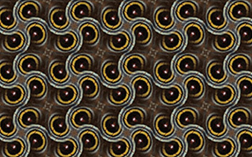
This is an era when the brands are quite aware of the fact that their logo will be viewed and accessed across multiple platforms. What has changed from last year is the fact that the brands are not only focusing on translating their business through the logo on the platforms but they are also eyeing on building a sturdier personal rapport with different groups of customers through the logo. People, nowadays, are targeting both the families and millennials and using the variable logos will adjust according to your requirement.
source:graphicmama.com
This particular trend makes sure that you get a one-size-fits-all approach with your logo design. Through the variable design, you can individualize the relationship between your customer and yourself. Iconography, typography, and good customization can serve the needs of your consumers in the best way possible.
New Age Geometry
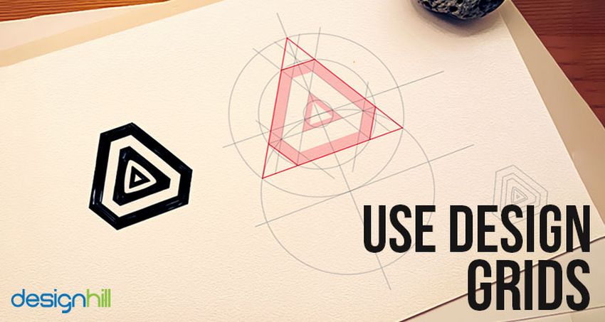
Once certain trends become familiar, people often limit the potential of the trends by limiting them to the point which is doing well! Geometrical designing patterns and styles have fallen prey to a distinction for being overly cold, mathematical, and even rigid! It is easy to define the geometrical logos but in order to offset the reputation earned by the geometrical logos, there is an upward trend that the designers are knowingly pushing the ceiling by pairing their creations with friendly compositions and lively colors.
source:designhill.com
The role of this New Age Geometry is giving the previous geometric logos a warmer makeover which would be clean, minimal and strong at the same time.
Logos that Trick the Eye
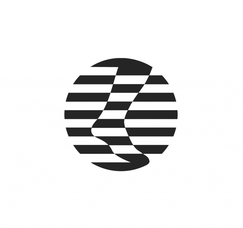
This logo trend is all about tricking the eyes of the viewers or users which will be the point of curiosity for them and thus, they will be more engaged to the logo before they get to know about it. If you need to go through the ideas, day in and day out time and again, considering and using the visual tricks can keep the enthusiasm for logo alive for the users and you at the same time.
source:graphicmama.com
Not only it is the design pattern the logo designers are turning to for revitalizing their creativity but it is also going to be the next design trend in 2024 which will be ruling the market throughout. The art of distortion and perspective will come in handy by presenting your logo to the audience and giving birth to a visual glory that cannot be ignored.
Purposeful Colors
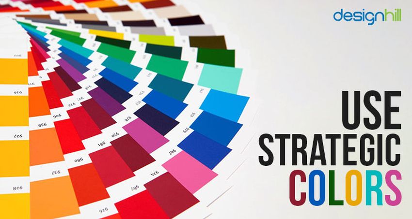
Brands can shape an authentic relationship with the audience by an inventive method which is done with the storytelling with colors. You do not have to be an expert to understand the color theory that simply says that Yellow conveys the freshness, energy, success, and confidence as well as it helps is quick decision making. So, when you want to convey such messages, you need to consider yellow as the color of your choice – it’s that simple.
But this trend can get complicated as well! When a brand’s success depends entirely on the color selection itself in order to express the identity, it will lead you to a sheer complication while choosing one color that may mean many things! The success will depend on the selection of the right color palette!
source:graphicmama.com
Rather than using random colors just to attract the eyeballs, picking the right colors would help a brand communicate more easily with the audience. In 2024, the designers will be seen to place the colors in a more purposeful way with the intention of displaying the brand’s statement through the colors.
Negative Space
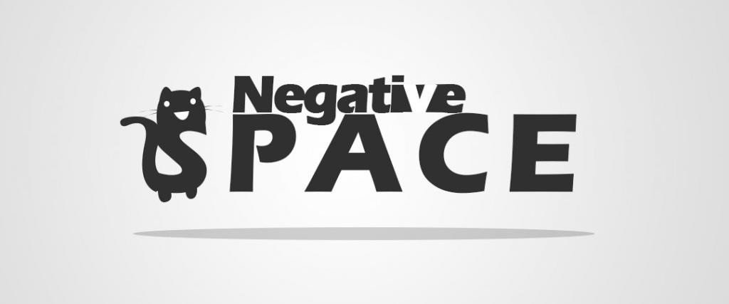
Negative space is one of the most interesting characteristics of a logo which can make or break your business’s brand identity. If you can successfully create a logo with proficient use of negative space, it can do wonders but on the contrary, the vice versa will strike you down!
One of the best examples of a greatly used negative space on the logo is the one of FedEx! If you take a look at the logo of the courier company, you will be able to find an arrow symbol concealed between E and X! This logical representation of courier delivery service through the logo makes this it the most appreciated and celebrated logo for using the negative space in a hugely positive way! Thus, in 2024, we are surely going to witness a boatload of designs using negative space effectively.
source:blog.prototypr.io
So, these are the logo design trends of 2024 that you need to follow in order to get the amount of success you have been aiming for. Always remember, your logo is not only a piece of graphics that attract a user; rather it’s a way of communication which will convey your brand to the audience you serve. Thus, the logo you will design in 2024 should be visually appealing as well as storytelling!

