The world of charting offers many interesting and informative options. Some of these options include candlesticks, point and figure, and line charts. According to tutorials by AskTraders.com, each of these charting options have their own pros and cons in technical analysis. This is why it is important to take a look at some of those differences that each types offers.
Page Contents
Line Charts
source:apexcharts.com
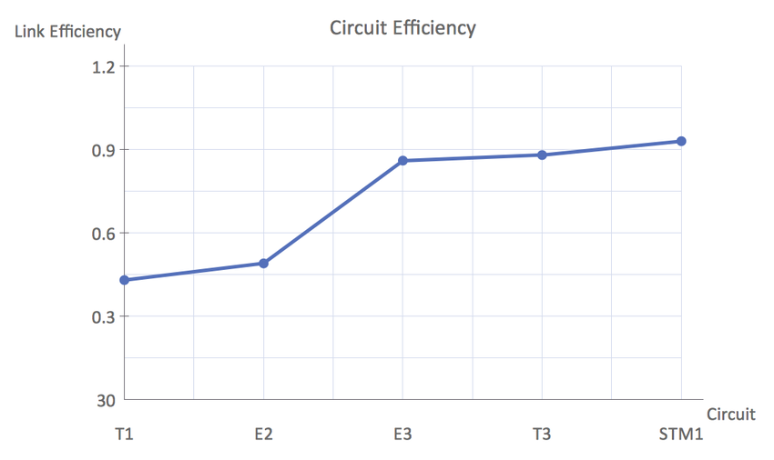
The Line Chart is one of the most simple and basic price charts, and some will argue that it gives participants the least amount of economic information. On the top pane of the chart, the first line is drawn with information taken from the close price that occurs during each unit in time. For example, if the chart in question is a daily one, it means that the closing economic price for each day is the value that is used. Conversely, on a 30-minute chart, it means the closing price accounts for each 30 minute period that is plotted.
Positives for Line type include the fact that they are a simple viewpoint of economic price movement. They can be a good choice to use whenever participants are comparing the relative performance of different assets the same chart. However, some of the negatives of Line Charts include the fact that they don’t show factors like the Open, Close, High, or Low for the asset in each trading period. The economic range for each interval is important many decisions are made based on the bearish or bullish momentum that is visible in the economic charts.
High Low Close Charts (HLCC)
source:slidegeeks.com
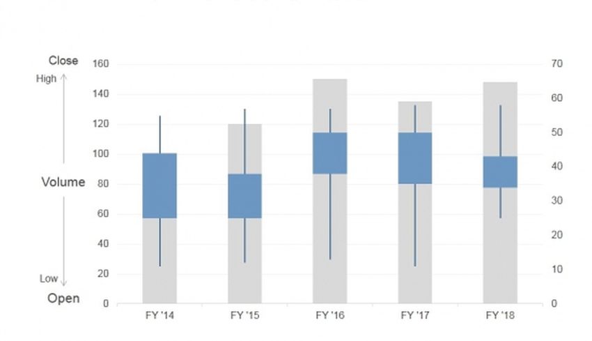
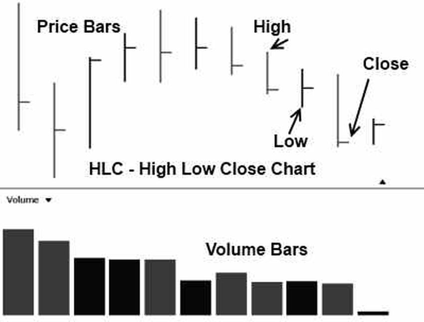
HLLC will sometimes be described as a step above what is seen on a Line Chart. Essentially, the HLLC allow participants to plot added data through the economic chart. For example, participants can show each individual bar as it represents the high and low from a certain period.
Positives for the High Low Close includes the fact that it has more information that is made available relative to Line Charts. HLCC show the range of the periodic economic interval. In other words, they can show whether the asset price closed at highs (a bullish event) or at the low (a bearish event). Negatives for the HLCC include the fact that there is no opening price shown on the chart. Opening market price can be important because it can allow participants to see if prices moved higher or lower during the period.
Open High Low Close Bar Chart (OHLCBC)
source:liberatedstocktrader.com
OHLCBC are often the favored chart of choice anytime someone is looking for an improvement on the standard Bar Chart. In cases where participants like using bar charts, this next example offers a range of the period’s economic activity (which includes the open and close). Positives of OHLCCinclude the ability to instantly see whether the period above or below the open.
Japanese Candlesticks
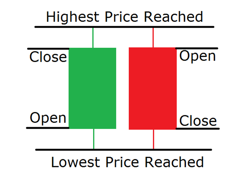
Japanese Candlesticks are used widely and extensively throughout the regions of Japan and broader Asia. They help participants gain a foothold in global view. Japanese Candlestick offers participants excellent insights with respect to current/future economic movement. It is given the name “Candlesticks” due to the fact that they appear the same as candlesticks (i.e. they have a wick and a candle body).
source:forextraininggroup.com
Positives for these Japanese Candlestick include the fact that they offer excellent viewpoints of all aspects of the price. Visually illuminating due to the fact that they make it easy to see economic trends. Japanese Candlestick Charts connect the participant psychology with the economic pattern. Experts say that there are also a great deal of Candlestick patterns that can be learned.

