Let’s face it – we are all heavily dependent on the internet. We have created a tendency to look there first for everything we want to search, buy, or find out. For that reason, no private business owner today can imagine starting a business without a good web designer.
A website is a basic source of marketing, advertising and the best way to make product information available to people around the world. In the sea of such sites today, in order to stand out, you need an innovative and unique creation that will attract the attention of every potential user. And not only to attract attention – but often to sell. That’s why it’s a very important way of interpretation that will be a great asset for placing on the market. And that, of course, is the shortest path to success.

source:pxfuel.com
There are many ways you can make a good website. What is fundamental is that it needs to be unique, compelling to the reader, and yet easy enough to use. Keeping up with world trends is always welcome. As well as supporting minorities, endangered and discriminated groups in society, which announces to people around the world that we’re all the same and equal through the design itself. It should be equally accessible to older and younger generations and also to the individuals and groups with disabilities.
In the following lines, you’ll read about the ways in which you can make your page modern and creative and make your client and all readers satisfied. So, stay tuned.
Page Contents
1. Illustrations

source:pxfuel.com
According to CyberOptik, in order to make your website as interesting and as accessible as possible to the visitors in general, you can complete it with various illustrations. They’re increasingly popular in the world of web designers and bring content closer to the user in a creative way. This is suitable for older, but especially for younger audiences, and this way of presentation will be easier to ‘catch’ and more fun for them.
Numerous online sources of free illustrations keep emerging with each passing day. They additionally contribute to the completion of the pages with colorful and lovely illustrations in the form of people or some objects in the 3D dimension.
Most often, there’s a great variety of colors to which the human eye reacts positively – that’s a psychological fact. Also, a trend of painting all people in one color in order to eliminate diversity seems to be quite popular nowadays. So don’t hesitate to join forces with a good graphic designer and make a masterpiece that you’ll be proud of.
Play with fonts, various color palettes, and especially if your job involves design in an area that involves relaxation, fun, or hedonism.
2. Interactive content

source:digitalmarketinginstitute.com
With the advancement of technology, human appetites for something new and intriguing are constantly growing. So, when they enter your site to seek the necessary information about your services, a boring white background with a bunch of letters written on it won’t keep them there for a long time. That’s for sure. For that reason, letting the visitors connect to the page in some way might be a great strategy – and it can easily be achieved by inserting interactive content.
We’re witnessing the existence of responsive sites where with just one click you can quickly go from the top to the bottom of the page, without scrolling and scrolling… and endlessly scrolling on the screen. Also, audio effects through which the website communicates with you might be one of the options, too.
You can allow users to activate the offered options by voice, making it easier for them to search. There are many ideas, and it’s up to you to use them and put in a little of your imagination.
3. Pay attention to typography

source:assets.awwwards.com
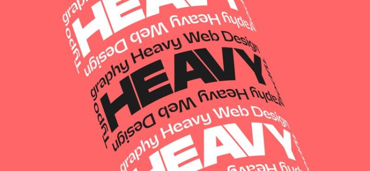
No less important than illustration or interactive content is the way we edit and arrange the text itself. You’ll often have the opportunity to meet clients who’ll want to make something customized and specific that will represent their product in the most absorbing way.
This is a good way to present their brand, especially if the logo itself consists of letters. It’s the moment when you have to choose the right typeface and font for a given project. Any site that aims to sell something should highlight products in an unobtrusive font and let readers know that they can do a faster search.
Even those who don’t have time to read the whole text can quickly notice the most important thing and decide to buy something. Let’s say they’ll be grateful for the concise text and that they’ll support the seller.
4.Video effects

source:pxfuel.com
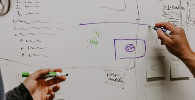
Static wallpapers are slowly becoming a part of web history, and moving images and videos are taking precedence. You’ll agree that, when a user enters a site where a video is waiting for him, there’s a high probability that they’ll be intrigued to watch it to the end. This way, a significant step is already achieved in keeping their attention.
Of course, no one likes too much noise, so make sure that the video is not too loud or intrusive while designing. Don’t set the images to change too fast, but at a slow pace, to make it easier to follow. Make an effort to enrich it with information that keeps users there.
For example, if you’re creating a site for a travel agency, let the colorful shots of beautiful landscapes help the visitor to decide as easily as possible what their next destination will be. There’s no doubt that this trend will be applied for a long time in the future.
Of course, it’s much easier to make some cool content when you have a great platform, but it’s not always so simple to choose one. That’s precisely why virtual places like Webpage Scientist possess entire bases of platforms, reviews, evaluations and much more. Much easier than spending a whole eternity to find a proper builder, right?
5. Diversity respect designs
We live in times when discrimination is rather prevalent. It’s recommendable for experts from different fields, including this one, who have the opportunity to influence the consciousness of society, to do so. Specifically, on the example of web design, different graphic and video solutions can represent tolerance for diversity, regardless of cultural, religious, ethnic, age, gender, or sexual affiliation.
It’s also a great idea to make your website accessible to people with disabilities, for example the blind – in some countries it’s a must. Even if it wasn’t, you should do it, as this increases the chances for progressing and it will gain you some truly positive feedback.
6. Virtual tours

source:360rumors.com
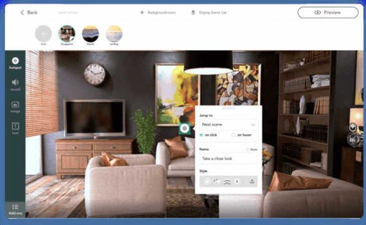
As the last, but not the only remaining example of decent ideas, there are some lovely virtual tours.
Sometimes your clients’ business will be largely location-based. Let’s take another example of a travel agency. In order to show their passengers what awaits them when they arrive at the destination and thus wake up their desire to travel, you can present it to them adequately.
The best thing is definitely a 360 degrees virtual tour of the places you’re offering. In that way, with one finger movement, they’ll feel a part of the atmosphere and the desire to pay for the trip as soon as possible.


