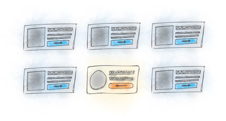
The first step into building a great design is creating an effective wireframe. It gives you an initial picture of how the website’s fundamental elements will appear and help you identify what’s more effective and what wastes your time before the actual design is out. The ideal wireframe eliminates the trial-error game, opens room for discussion and further ideation. It also eliminates flashy distractions, allowing you to focus on what works entirely. Here are the tips to help you create a functional wireframe and get your design off its feet from the first attempt.
Page Contents
1. Have a Clear Objective

img source: executiveleader.com
You have not commenced your journey, however long you’ve been traveling until you specify where you are going. Before you embark on creating a wireframe, ask yourself what you want to achieve with the process. This question gives you a clear direction on what actions you need to take and how. Without a clear goal in mind, your wireframe won’t yield much value.
2. Grid-It Out
In most cases, website design involves several parties, each working on specific tasks simultaneously. While creating a wireframe, you are making a layout that will affect almost all stakeholders’ jobs. That’s why you need to make every element in the wireframe changeable, adjustable, and easy to scale to factor in opinions and demands from fellow collaborators.
The best and fastest way to create a wireframe is using a grid as it offers a flawless adaptation to the prototype. Also, the grid system makes it easy to assemble and design diverse components in a structured and straightforward way.
3. Strive for Consistency

img source: uxdesign.cc
Consistency is another very fundamental part of creating wireframes. You need to ensure all the user interface components remain as consistent as possible. You should debate and decide on what you want to include and what not to. You need to make fonts, colors, spacing, tabs, labels, and buttons on every screen have a consistent design throughout the website. That eases your job, helping you and the stakeholders focus on the project’s layout rather than the wireframe’s idiosyncrasies.
4. Strive for Flow, Not Individual Screen
User experience (UX) is a customer’s journey when utilizing your product. As the designer, your central goal is to make this journey as smooth as possible. The best way to achieve this dream is to focus your energy on user interactions and not the aesthetics of a single screen. You may want to focus on the type of experience you want to create for your users and what’s important on every screen.
Focusing on flow means you strive to identify how a single screen connects to the others and how your users interact with it. Another focus to consider when creating wireframes is what the customer expects on each screen and how to fulfill their anticipations.
5. Utilize Wireframe Tools

img source: uxdesign.cc
With the right plan and skills, your job isn’t right till you find the best tools. Check out the best website wireframe tools that can attend to your needs and offer the compatibility you desire. Sketch wears the crown of the best tool for creating a wireframe. However, you may also want to try work in Adobe XD’s knowledge, and experience as the brand also offers exclusive experiences. The bottom line is, find what works best for your objective, compatible with your working system, and provides the solution you need.
The primary key behind an effective wireframe is to keep it as simple and adjustable as you can. Your main goal is to discover page elements, navigation, and the general flow of your user and enhance.


