Not all ‘Contact Us’ pages are created equal. In fact, some serve more as a source of frustration than they do convenience. With that in mind, what makes a great contact page on a website? Is there a way to optimise yours for greater conversions? Read on and let’s find out…
Page Contents
What Makes a Great Contact Page on a Website?
So, what constitutes a great contact page on a website then? Remember, you are trying to encourage people to reach out and make an inquiry. Ideally, they’ll book an appointment and sign up for your services. However, if you make it more complicated than it needs to be, you’ll put people off.
Here’s are some features we recommend:
Include Plenty of Social Proof

Source: salesfire.co.uk
Your prospects may be having doubts which is why including social proof on your contact page is a good approach. This lets them know that you have successfully helped dozens and dozens of people before them and can (hopefully) do the same for them.
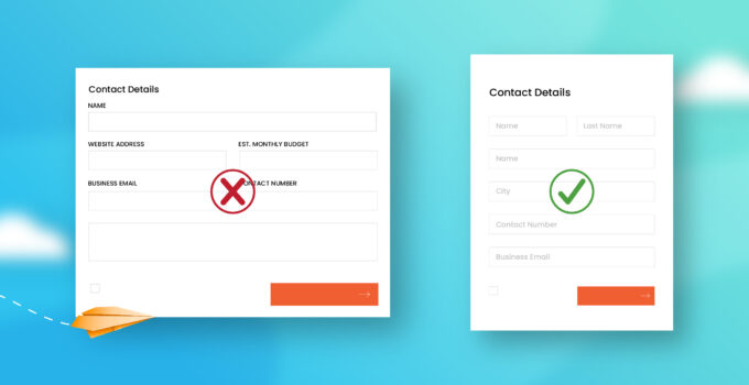
A Clear and Simple Contact Form
For some business types a contact form is a necessity. If this is the case, make sure that yours is clear and simple. Don’t include lots of mandatory fields and simply allow people to include the basics.
Don’t only Have a Contact Form

Source: nicepage.com
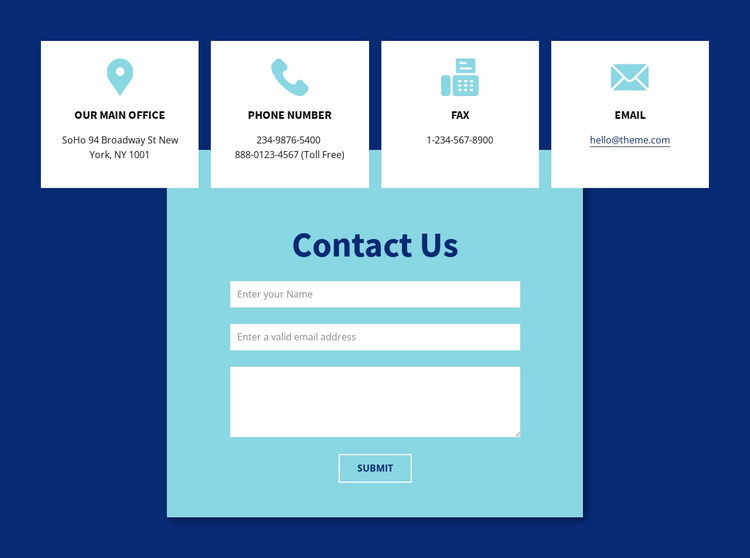
The best contact pages offer a variety of different ways to get in touch. A contact form is OK, but some people may prefer email or to pick up the phone and speak to a customer service representative directly. Give your users a variety of options.
Add Your Socials
While not mandatory, adding buttons to your social accounts is always a good idea. For those who perhaps aren’t quite ready to sign up, they can head over to your Facebook and explore your brand even further. If you’ve got lots of social proof and positive interaction with your audience, even better.
Add a Map
When you add an interactive map to your contact page it adds to your authenticity. Even better if you can include images of your premises! Frequently asked questions: while it’s good to have a dedicated FAQ page, you can also include some of the more frequently asked questions on your contact page.
This can help customers overcome quick objections and potentially find the information they need without having to burden your customer service department. This online marketing agency has an FAQ at the bottom of their contact page and it makes a big difference to the overall look and feel – it adds value.
Is There a Way to Increase Conversions on Your Contact Page?

Source: weidert.com
If you want people to reach out and book an appointment, you need to provide the path of least resistance for them to do so. As mentioned above, if you’ve got a well-optimized contact form and you provide a contact telephone number, you’ll be off to a good start.
Include social proof and an FAQ, and you’ll notice a much better conversion rate as well. Provided the quality of content is on point and you’ve nurtured your traffic well with high-value sales copy, you shouldn’t have too many problems.


