Who doesn’t want their brand to stand out at trade shows? In a competitive industry, standing out visually can literally determine how many leads and customers you get. If your brand image looks more appealing than other vendors, you’ll attract more attendees. However, you can’t just slap your logo on a giant backdrop and expect it to be enough.
Standing out visually at a trade show requires strategy. You need a strategy that incorporates your brand’s image with the wise use of 3-dimensional space in your trade show booth.
Page Contents
How you use 3-dimensional space matters
How do you feel when you walk into a cluttered house? Being surrounded by clutter isn’t the most inviting experience, even when you’re visiting a friend you enjoy spending time with. The same applies to your presence at a trade show. No matter how much people love your brand, a cluttered space will make them feel uncomfortable.
Inexperienced trade show exhibitors generally set up their space with folding tables and chairs, draping heavily branded banners over the tables. They also pile plenty of objects on top like prize wheels, mugs, sign holders, trinkets, and flyers. An example of this distracting clutter can be found in the sixth image from the top of this post about trade show presentations. Booths set up with clutter will work against you.

source:inc.com
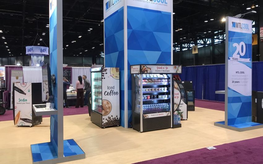
Experienced trade show exhibitors utilize 3-dimensional space intentionally. Most rely on a portable trade show booth, and strategically place objects and materials inside – sparingly. The visual impact of beautiful graphic design in a clutter-free space is appealing to attendees. For instance, modular booths are designed for exhibitors to display multimedia presentations from flat screen TVs mounted (and locked) to the wall. This type of seamless presentation looks better than setting up a monitor on a card table with visible wires.
Not all booths have the same layout. To see what’s possible, check out Poster Garden’s selection of trade show booths. Your booth doesn’t need to be elaborate. Sometimes simple is better.
The way you use 3-dimensional space at a trade show matters more than the design of your logo. Your logo is important, but a perfect logo won’t make up for a cluttered booth.
Your logo should translate well to print
Your logo might look great on your website and t-shirts, but what does it look like on a giant canopy? What does it look like on a 10-foot tall modular booth panel?
Your logo stands out when it looks good on the medium it’s been printed on. Some logos look great small, but lose their impact when enlarged. If your logo doesn’t translate well to larger printed mediums, create a new version of your logo for your trade shows. A skilled graphic designer can turn your logo into something that will make an impact when enlarged.
Think of your booth as a landing page
Just as you’d prepare a landing page for your website, you want to prepare your booth as if it were a landing page. Your booth needs to stand out to attract attendees from a distance and hold their attention once they come in close to check you out.
This podcast emphasizes the importance of using the same components of a sales page, including headlines that sell, customer opportunities, trust signals, and a call-to-action. For example, any headlines seen from a distance should be created on the same principles that you’d use to create Facebook ad headlines. The podcast also emphasizes the importance of a strong call-to-action. You don’t want people visiting your booth without at least signing up for your email list.

source:inc.com
Standing out is an art form
Standing out at a trade show is an art form. What will make your booth stand out depends on your industry. What’s attractive in one industry might be off-putting in another. For example, if you’re in the financial industry, you probably won’t attract people with satire. However, if you’re in marketing, satire can be highly effective.
Standing out isn’t hard, but it requires a strategy. Before your next trade show, take a close look at how you present your brand. Scrutinize the way you use 3-dimensional space and look for ways to improve your presentation. Adjust your logo if necessary, and invest in high-quality equipment. Card tables are easy to lug around, but a professional setup will bring you more leads.


