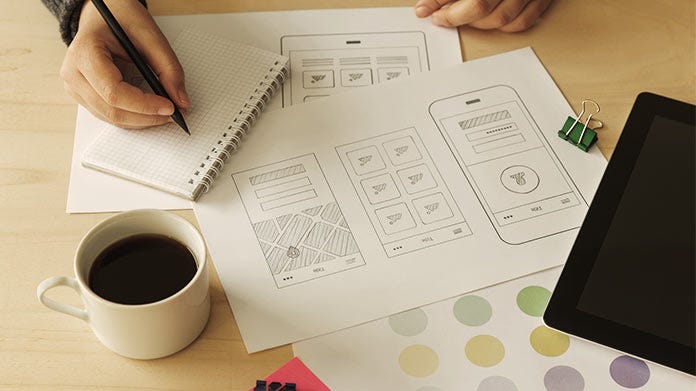
Low fidelity wireframes are basic visual representations of a webpage or app’s layout, often devoid of detailed design elements, colors, or graphics. They play a pivotal role in the design and development process, serving as the blueprint for the final product. By stripping down designs to their bare essentials, low fidelity wireframes become a playground for creativity, allowing designers to focus on functionality and user experience.
Page Contents
The Basics of Wireframing

Source: zale.hr
At its core, wireframing is about visualizing the structure of a digital product. It’s the skeletal framework of your website or app. While high fidelity wireframes are detailed and closely resemble the final product, low fidelity versions are more abstract, focusing on space allocation and user flow. This distinction is crucial in understanding their respective roles in the design process.
Advantages of Low Fidelity Wireframes
Low fidelity wireframes shine in the early stages of design. They’re quick to produce, making brainstorming sessions more productive. Their simplicity encourages feedback, allowing for swift iterations. By not getting caught up in design specifics, they ensure the team’s focus remains on usability and overall user experience.
Streamlining Conceptualization
These wireframes are all about the big picture. They help designers concentrate on layout, navigation, and the overall user journey. For instance, in e-commerce, designers can map out user pathways without being distracted by product images or typography. It’s about understanding user needs and designing the most intuitive path to meet those objectives.
Encouraging Collaboration and Communication

Source: axongarside.com
Low fidelity wireframes act as a universal language, bridging the communication gap between designers, developers, and stakeholders. They provide a clear visual that everyone can understand, discuss, and critique. Tools like Sketch, Figma, and InVision further enhance collaboration, allowing real-time edits and feedback.
Iterative Design and Rapid Prototyping
The beauty of low fidelity wireframes lies in their flexibility. Designers can quickly iterate versions, testing and refining concepts before diving deep into detailed designs. This approach saves time, reduces costs, and ensures the final product is both functional and user-friendly.
Unleashing Creativity with Constraints
It might seem counterintuitive, but constraints can boost creativity. With low fidelity wireframes, designers work within set boundaries, focusing on layout and functionality. This structure becomes a canvas for innovation, pushing designers to think creatively while adhering to essential design principles.
Tips for Effective Low Fidelity Wireframing

Source: uxplanet.org
For impactful wireframes, start with pen and paper. Sketching allows free-flowing ideas without software constraints. Once the basic layout is set, digital tools can refine the concept. Always prioritize user needs, iterate often, and seek feedback. Remember, the goal is continuous improvement.
Real-world Examples
Consider Airbnb. In its early days, the team used low fidelity wireframes to conceptualize the user journey. This approach allowed them to focus on user experience, leading to the intuitive platform we know today. Challenges, like deciding on information hierarchy, were tackled early on, ensuring a seamless transition to high fidelity designs and development.
Conclusion: Harnessing Creative Power
Low fidelity wireframes are more than just design tools; they’re catalysts for creativity. By focusing on structure and user experience, they unlock unparalleled innovation. As designers, embracing this approach means harnessing the full potential of creative design, leading to digital products that resonate with users. Embrace the magic of low fidelity wireframes and watch your designs transform.


