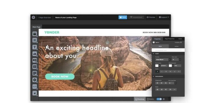
A landing page is the face of your website and the online profile of your business. The purpose of a landing page is to drive leads, convincing visitors to sign up, download, or buy your product or service. Your landing page needs to be good enough so it can convince your visitors to act, and without it, your business will never grow.
So because of that, we are going to tell you a couple of tips on how to build a powerful landing page.
source:webdesignerbyronbay.com.au
Page Contents
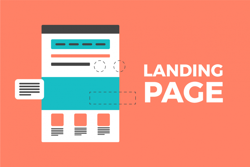
It’s very important that your landing page is simplistic in nature so it can tell your visitors what is the purpose of your website. Navigation through your landing page should be very simple, the content needs to be visible, and there shouldn’t be any non-relevant things in it.

source:webdesignerbyronbay.com.au
2. Convince With Color
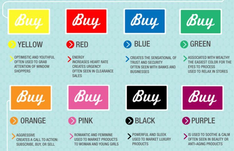
Color design is key for any website because color tells emotions. Research shows us that it takes visitors between 65 and 90 seconds to understand what the purpose of the website they are visiting is. And color plays a huge role in formatting the opinion of a customer.
source:pagewiz.com
3. Typography
The best “how to create a landing page” guides rarely touch on typography. But you would be surprised at how important role typography plays when creating a landing page. Font type, size, color, tracking, and spacing play a HUGE role when it comes to making your content more comprehensible to the visitor reading. Well-Formatted typography ensures that the reader maintains his focus on your landing page; subsequently, the chances of the visitor buying your product are increased.

source:pagewiz.com
4. Optimize it for SEO
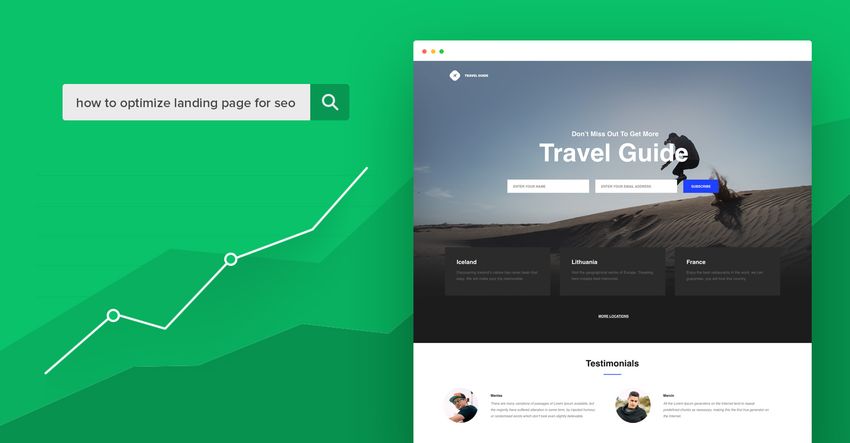
SEO is hugely important for any website because it is the surest way of driving organic traffic towards your website. Make sure to always pay attention to SEO on your landing page, and make sure to have it optimized for search engines. Since your landing page is the go-to page of your website, you need to prioritize the SEO so people will open it firstly.
source:businessinsider.com
5. Optimize for Mobile Viewing
Did you know that mobile traffic accounts for more than 70% of all online website traffic? You would be amazed that there have been 2,6 billion smartphones registered on Google, and the numbers are going to constantly rise. According to data from Google, 60% of mobile users will not return to a website that is poorly optimized for mobile devices, and 40% will visit your competitors. One of the most important tips is to always optimize your landing page, and the rest of your website, for mobile viewing.
source:mailerlite.com
6. Add Images
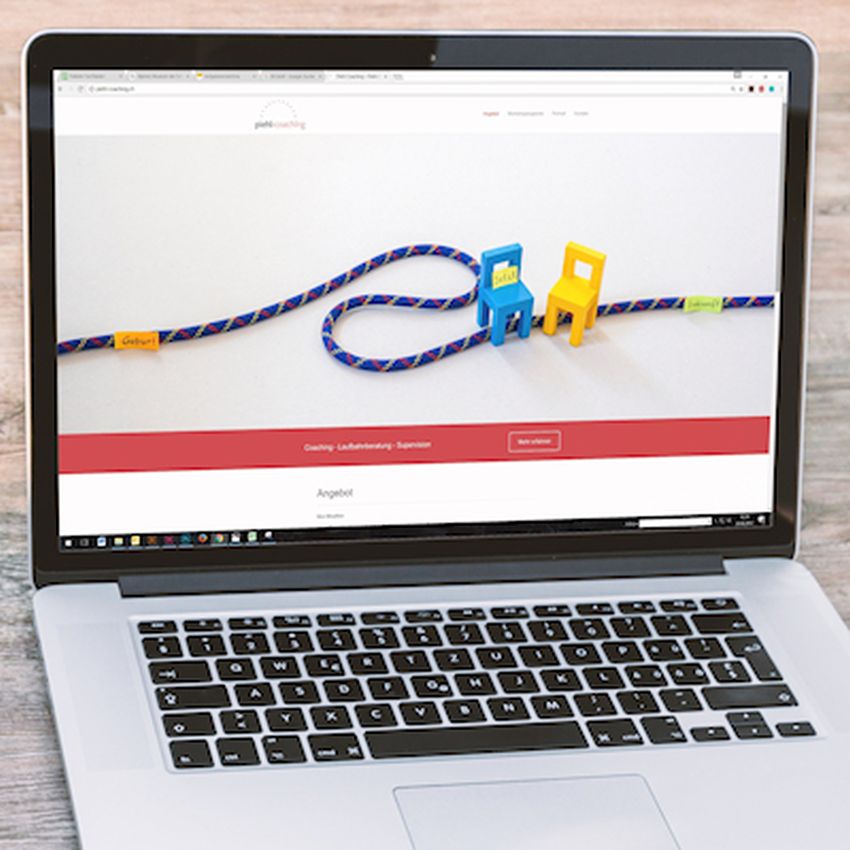
Images add more towards your landing page visual appealing, according to statistics from Google. While it’s tempting to use stock images because they are free, a better option would be to use your face or that of your employees. A lot of case studies have found that real images of people drive conversion rates up to 50% more over those of stock photos. The reasons behind it could be the fact that people have a high level of empathy and we tend to trust similar people like ourselves.
source:scullywag.com

