If your business has a website then it is absolutely vital that you focus on the user experience above all else. It doesn’t matter whether or not the site is used to sell things directly or if it is used simply as a shop window for your business, the user experience is the single most important thing.
Menos Hiras was the man who helped my company to really nail our website and during the time that we were lucky enough to work with him, he really taught us a great deal about what users expect when they hit a website.

source:unsplash.com
We live in a world where everything is on-demand from television to movies, music to our internet activities and this has created a public which just doesn’t have the time or the patience to wait around. This worrying trend results in many users switching off a website and moving on to another if they don’t get the experience that they feel that they deserve, and that could result in them leaving your page and going off to a competitor.
Naturally, this is the last thing that you need, which is why it makes so much sense to focus on what exactly the user experience is like on your website. These are the key factors which people will look at when they are using your website.
Page Contents
Design

source:wikihow.com
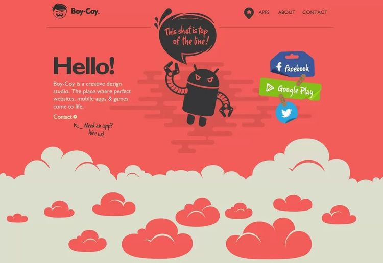
The first that people are going to be looking at is the design of your website, the design should tell a story about who you are and what you do, it should be sleek and nice on the eyes. This is the first thing that a user will see when they hit your site and it is something which they need to blow away by.
When designing your site you need to be thinking about the structure of it but also colors. Different colors invoke different moods and thoughts and this can really help to make your users feel more at ease, and more likely to want to buy.
Slow Page Load

source:dreamhost.com
To go back to what we were saying about the patience, or lack thereof that people have when they use the internet, the page load time of your site is of paramount importance. If the pages take more than 3 seconds to load then it is estimated that you could lose up to 35% of the users. This is a massive amount to lose simply because the website is not properly maintained.
Page load times get much slower when a website is packed with content such as media, photos and videos can significantly slow a page down. On top of this, you may also find that using a wide variety of plug-ins on your site, which are like applications that your website uses, can significantly slow down the functionality of the page. Ensure that you have regular maintenance on your site to keep that page load time as quick as it can be.

source:blog.templatetoaster.com
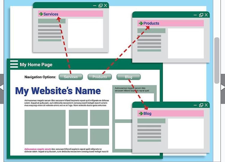
Something else that users don’t have the time for is to figure out how to bounce around your website. They want the navigation to be very easy and they want to know how to get from one point on your site to another without having to invest the time in doing so.

source:sodapopmedia.com
There is often a temptation from businesses and website owners to overload the website with an abundance of menus and sub-menus, but all this serves to do is confuse the user and make getting around the site far more difficult.
Keep things sleek and simple, make relationships between landing pages which users are likely to wish to move between. In doing this you will not only be encouraging people to move between your site but you will also keep their engagement and their attention.
Pop-Ups

source:uxdesign.cc
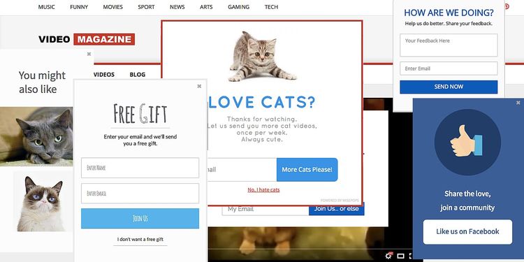
We all know that a call to action is a very positive thing to put on your website and it can help you to promote the business and its products, it can also help to grow an email list which is going to come in very handy when it comes to marketing.
Somewhere along the way however people got confused with how to set up the call to action and many websites now have far too many pop-ups which simply make a user turn away. A smart, well thought out call to action will help your business, overwhelming the user with multiple pop-ups that only serve to annoy them will do the complete opposite for your business.
If you want users to stay on your website, involve and engage with what you are promoting and you wish for them to leave having made a sale or with a good impression of who you are as a company, user experience should be at the top of your list of priorities.


